“How do I do that in R?”: Ethographer
What’s an accelerometer?
Next up in our series of tutorials is a revisiting of some ancient work that I conducted while earning a masters degree at the University of Cape Town. In this project I compared patterns of shark swimming behaviour that were observed visually, with observations generated by interpreting accelerometer signals. “What’s an accelerometer” you ask? Well you’ve probably got one in your pocket. An accelerometer is an instrument that measures acceleration, i.e. changes in velocity. Remember that changes in velocity are the result of changes in position, so an accelerometer is ultimately measuring movement. Your smart phone most likely includes an accelerometer as part of its circuitry, and it is this device that helps make sure your screen is always shown upright. Accelerometers are also responsible for the unique style of gameplay found in the Nintendo Wii. Imagine strapping a Wiimote to the back of a shark and watching it play Wii Sports. That’s what I did.
I used some nifty software called Ethographer to interpret the signal generated by the accelerometer. The program is an extension to IGOR Pro and was written by Kentaro Sakamoto at the University of Tokyo specifically for the interpretation of animal behaviour from accelerometers. The functions in the program perform a spectral analysis of the accelerometer signal and then categorize the spectrum into behaviours. These days I would probably use a Hidden Markov Model to achieve the same outcome, but for the sake of learning, I’m going to recreate the Ethographer analysis from the paper below, entirely in R.
Sakamoto KQ, Sato K, Ishizuka M, Watanuki Y, Takahashi A, Daunt F, et al. (2009) Can Ethograms Be Automatically Generated Using Body Acceleration Data from Free-Ranging Birds? PLoS ONE 4(4): e5379. https://doi.org/10.1371/journal.pone.0005379
Continuous wavelet transform
The idea behind the workflow is to first decompose the accelerometer signal into a time-series of frequency and amplitude. These two components can help describe different behaviours. Some might be low frequency, low amplitude, like a gliding or soaring movement pattern, while others might be high frequency, high amplitude quick burst movement. This decomposition is achieved through the use of the Continuous Wavelet Transform (CWT). Understanding the inner workings of the CWT is beyond the scope of this tutorial, but it involves convoluting the input signal with scaled and shifted versions of a “mother wavelet”. The end result is time-frequency representation of the input signal. Think of it as decoding a song back into its sheet music form. Providing information on which notes are played, for how long, and at what volume. it is no wonder then that terms like “scales” and “voices” are used in this process. The CWT is widely used for image compression and pattern recognition, and in studies of the El Niño-Southern Oscillation.
K-means clustering algorithm
The next step is to take the time-frequency spectrum and partition the signal into categories. There are a variety of supervised and unsupervised clustering algorithms to pick from. Ethographer uses the unsupervised k-means clustering method. This approach works by first placing k random points within our sample space. These points serve as the centroids of k groups which will categorise the data based on each points proximity to these centroids. The points are classified and the centroids of the groups are recalculated. The data are then again grouped based on their distance to these new centroids. And the process is repeated until the centroids no longer move.
Let’s begin by installing and loading the necessary packages
install.packages("RWave","fields","zoo")
library(RWave)
library(fields)
The Ethographer paper starts with a demonstration of the technique on a standing composite cosine wave. The wave is comprised of a 0.5s period cosine wave for ~7seconds, then two cosine waves with periods of 0.5s and 0.25s for another ~7 seconds We first generate this wave at a sampling rate of 64Hz.
#sampling rate
dt<-1/64
#stationary composite signal 2Hz, then 2Hz + 4Hz
x1<-seq(1,7,by=dt)
x2<-seq(7+dt,12,by=dt)
xn<-ts(c(cos(((2*pi)/0.5)*x1),cos(((2*pi)/0.5)*x2)+cos(((2*pi)/0.25)*x2)),
       start=1,end=12,frequency=(1/dt))
plot(xn)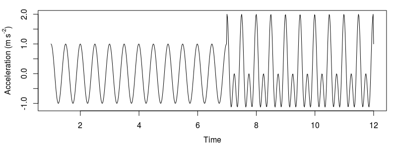
Model data constructed by a cosine function with a period of 0.5s and two cosine functions with periods of 0.25s and 0.5s
The next step is to set up the CWT. We choose a central frequency for our wavelet w0 of 10Hz. This should generally be no higher than the maximum frequency we can detect, the Nyquist, or “folding” frequency of the signal, which is equal to half the sampling rate. Cmin and Cmax are the minimum and maximum periods we are interested in. We determine the number of octaves, nOctave, from the maximum period Cmax. In the transform, the mother wavelet is scaled from its central frequency down, according to the range of octaves, and voices in between that we define here. This means that the largest scale will represent the central frequency w0. We run the transform using the function cwt, which uses a Morlet mother wavelet. In order to convert the scales of the wavelet to frequency we first generate a vector of the scales used in the CWT, and then relate these to the cycle period with the sampling rate and central frequency of the mother wavelet. Sakamoto et al. (2009) perform a correction on the modulus of the wavelet to relate the value to the amplitude of the signal, but I skip this step here.
w0<-10
#min and max period
Cmin<-0.05
Cmax<-1
#number of octaves and voices per octave for scales
nVoice<-64
nOctave<-ceiling((log((Cmax*w0)/(pi*dt))/log(2))-2)
W<-cwt(xn,noctave=nOctave,nvoice=nVoice,w0,plot=F)
#get a vector of scales used in cwt
scales<-sort(2^c(outer(1:nOctave,(0:(nVoice-1))/nVoice,'+')))
period<-(2*pi*dt*scales)/w0
image.plot(time(xn),period,Mod(W),
           col=rev(rainbow(64)[1:53]),
           ylim=c(1,0.1),
           xlab="Time",ylab="period",log="y")
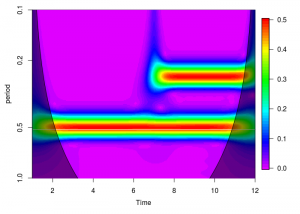
Behavioural spectrum of our model signal. Note the high amplitude bands corresponding to the two periods (0.5s and 0.25s).
I added some additional information to the plot in the form of a Cone of Influence. The shaded area illustrates the areas where the support of the shifted and scaled wavelet exceeds the length of the signal and edge effects become important. We can take this further and calculate theoretical significance levels for the wavelet power spectrum. We won’t calculate significance levels in this tutorial, but more can be read on the subject here, which appears to be the article responsible for the IGOR Pro CWT routines used by Ethographer in the first place, which is also recreated in the R package dplR. There are a number of packages that provide functions for performing a CWT, but I like RWave the most for its simplicity and flexibility.
The code for calculating and adding the Cone of Influence is below.
coi<-c(seq_len(floor(length(xn)+1)/2),seq.int(from=floor(length(xn)/2),to=1,by=-1))*(2*pi*dt)/(w0*sqrt(2))
polygon(c(time(xn),rev(time(xn))), c(coi,rep(ifelse(max(coi)>max(period),max(coi),max(period)),length(xn))),
        col="#00000075")
The next step then is to perform the k-means clustering. Note that the initial assignment of centroids is random, so you may end up with flipped results. Just change the index of the vector k$centers in the plotting function. In this exercise we cluster the data into k=2 groups by specifying 2 centers in the kmeans function call, and then plot the results against a time slice of the spectrogram at t=3s and t=11s.
#kmeans clustering
k<-kmeans(Mod(W),centers=2)
plot(period,Mod(W)[which(time(xn)==3),],type="l",xlim=c(0.1,1),xlab="Period",ylab="Amplitude")
lines(period,k$centers[1,],lty=2,col="red")
plot(period,Mod(W)[which(time(xn)==11),],type="l",xlim=c(0.1,1),xlab="Period",ylab="Amplitude")
lines(period,k$centers[2,],lty=2,col="red")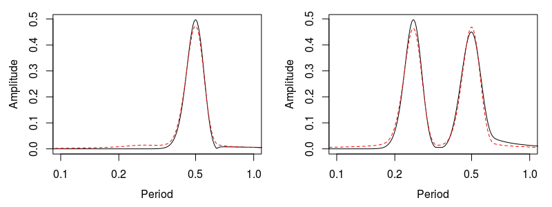
Local behaviour spectrum at 00:03 and 00:11. The peak amplitude of the local behaviour spectrum corresponds to the amplitude of original data at the corresponding cycle. Dashed red line is the output of the k-means clustering.
A Real Example
We’re now going to try this out on a real tri-axial accelerometer signal recorded from a captive common smooth-hound shark Mustelus mustelus. These next few lines read in the csv, which you can download here, format the columns appropriately, and convert it to a time series object.
options(digits.secs=1)
raw<-read.csv("/home/dylan/Documents/Projects/mustelus/data/20120315B.csv",skip=1)
#fix funny times with 0.0002 fudge factor
raw<-data.frame("Datetime"=strptime(raw$Date.Time..GMT.02.00,format="%m/%d/%y %I:%M:%OS %p")+0.0002,"X"=raw$X.Accel..g,"Y"=raw$Y.Accel..g,"Z"=raw$Z.Accel..g)
raw.z<-zoo(data.frame("X"=raw$X,"Y"=raw$Y,"Z"=raw$Z),raw$Datetime)
Each of the three axes refers to movement in the heave, surge, or sway axis. Our first step is to disentangle the acceleration due to tail movement (dynamic acceleration) from the acceleration measured from the gravitation of the earth (static acceleration). We accomplish this with a simple running mean, but there are many other approaches, like low-pass filters and Kalman filters when more sensors are available. The result of this running mean is the low frequency gravitational component, which we subtract from the original signal to estimate the dynamic component.
#3 second (15 points @ 5Hz) smooth window
sta.z<-round(rollmean(raw.z,3*5),4)
#subtract to get dynamic
dyn.z<-window(raw.z,index(sta.z))-sta.z
We then need to subset the time series to the period after the shark was released following attachment of the accelerometer.
#clip to experiment
raw.z<-window(raw.z,start=as.POSIXct("2012-03-15 11:13:55"),end=as.POSIXct("2012-03-15 12:18:07"))
sta.z<-window(sta.z,start=as.POSIXct("2012-03-15 11:13:55"),end=as.POSIXct("2012-03-15 12:18:07"))
dyn.z<-window(dyn.z,start=as.POSIXct("2012-03-15 11:13:55"),end=as.POSIXct("2012-03-15 12:18:07"))
The orientation of this particular accelerometer resulted in the tail movement (sway) of the shark being recorded in the Y axis.
plot(dyn.z$Y,ylab=expression(paste("Acceleration (",italic(g)[0],")")),ylim=c(-2.5,2.5))
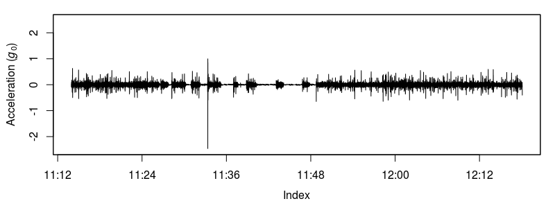
Sway axis dynamic acceleration of a swimming shark.
We set up and plot the CWT just as before.
dt<-0.2
w0<-16
nVoice<-32
nOctave<-5
W<-cwt(as.ts(dyn.z$Y),noctave=nOctave,nvoice=nVoice,w0,plot=F)
scales<-sort(2^c(outer(1:nOctave,(0:(nVoice-1))/nVoice,'+')))
period<-(2*pi*dt*scales)/w0
image.plot(index(dyn.z),
           period,Mod(W),
           col=rev(rainbow(64)[1:53]),
           ylim=c(max(period),0.4),
           xlab="Time",ylab="Period (s)",log="y",mgp=c(2.5,1,0))
#cone of influence
coi<-c(seq_len(floor(length(dyn.z$Y)+1)/2),seq.int(from=floor(length(dyn.z$Y)/2),to=1,by=-1))*(2*pi*dt)/(w0*sqrt(2)) polygon(c(index(dyn.z$Y),rev(index(dyn.z$Y))), c(coi,rep(ifelse(max(coi)>max(period),max(coi),max(period)),length(dyn.z$Y))),
        col="#00000075")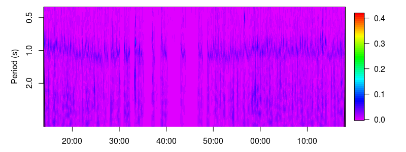
Behavioural spectrogram of a captive smooth-hound shark.
The k-means clustering is also run as before, though it will require a bit of finessing from the user. In my initial analysis I attempted to identify 4 different swimming patterns; steady swimming, gliding, burst swimming, and resting. I had some issues detecting gliding, but I did learn that specifying just 4 centers in the kmeans function would not capture the extreme swimming patterns at the ends of the spectrum (rest or burst swimming). In order to work around this I overspecified the number of centers and then combined those that were similar. In this example we are going to identify 3 swimming patterns, which in my analysis required starting with 6 centers.
#kmeans
centers<-6
k<-kmeans(Mod(W)[,period>=0.4],centers=centers)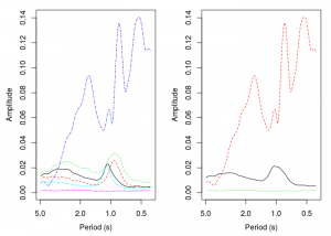
The left image is the result of the k-means clustering on 6 centers. The image on the right is the result after averaging the 3 centers with a dominant period of 1s.
I ended up consolidating the 3 spectra with a dominant period of around 1s. These clusters likely represent slight speed variations in the steady swimming pattern. We end up with one short period (high frequency) high amplitude behaviour, one low frequency behaviour, and one behaviour with a period of about 1s. Last up we plot an ethogram that shows where in time each of the behavioural patterns occur.
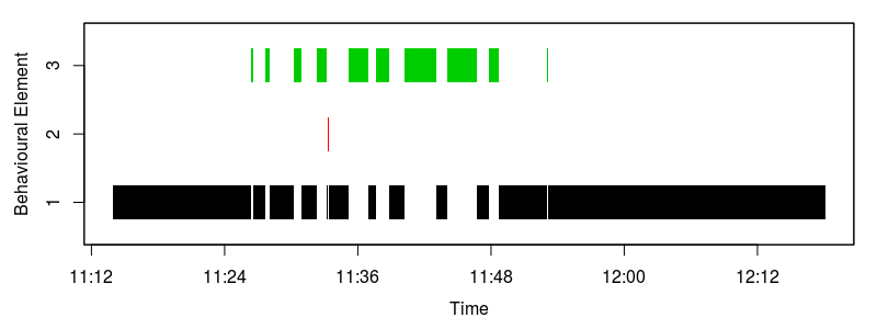
The accelerometer generated ethogram. The green behaviour reflects periods when the shark was not moving and resting on the substrate, red reflects bust, or fast-start swimming, and black represents steady swimming.
Some Remarks
And that’s that! The purpose of this exercise wasn’t so much to get into the nitty gritty of why certain decisions were made in the analysis, but to show how one would do what Ethographer does but in a free software like R. Ethographer offers many other features that might help in an analysis of animal movement, and I’d be willing to bet that every single one can be accomplished in R. Ethographer was a very helpful piece of software for me during this project but as I said before, having learned a bit more since then, I would probably go with a Hidden Markov approach. There are a few journal articles that demonstrate the use of Hidden Markov Models for the analysis of accelerometer data; it’s an incredibly powerful tool and one that I find myself using frequently. Perhaps that will be the subject of the next R tutorial!
3 Comments
Morgane Henry · May 19, 2020 at 3:07 pm
Thank you for this interesting post and your explanations! I was wondering how you produced the ethogram and how (if you did it) you extracted the dominant period or frequency from the CWT for your analysis?
Dylan Irion · May 26, 2020 at 8:59 am
Hi Morgane. Are you curious about the code for producing the ethogram plot, or just the theory behind it? The dominant frequency can be inferred from the spectrogram or the clustering spectra. In the spectrogram, it would be the areas where amplitude is highest (the darker areas). In my plot they is a band at about 1s, and some low frequency harmonics below that. The clustering spectra are just a 2d slice of this, so the peaks in the y axis represent the dominant frequencies. I just interpreted them visually, but you could probably do some kind of peak detection.
Morgane Henry · May 27, 2020 at 4:06 pm
Hi Dylan, thank you for your reply! I’m currently working with accelerometer data and your article helped me a lot to start my analysis. I’m using a slightly different approach now, but I would be interested to know the code to create the ethogram plot if it is possible.