Right from the beginning when ‘Cape RADD’ was just an idea, Mike was passionate on the fact that the name and logo didn’t matter a huge amount and what was most important was making the organization recognizable for its uniqueness and quality, so in turn the name and logo would become recognizable itself. I stumbled across some notes that I made in 2017 full of ideas on what to name the Marine Science Organization, as I read through in amusement of the names and in reflection of our journey over the past few years, I thought it might be interesting to share how we came up with the name and interesting facts about our logo.
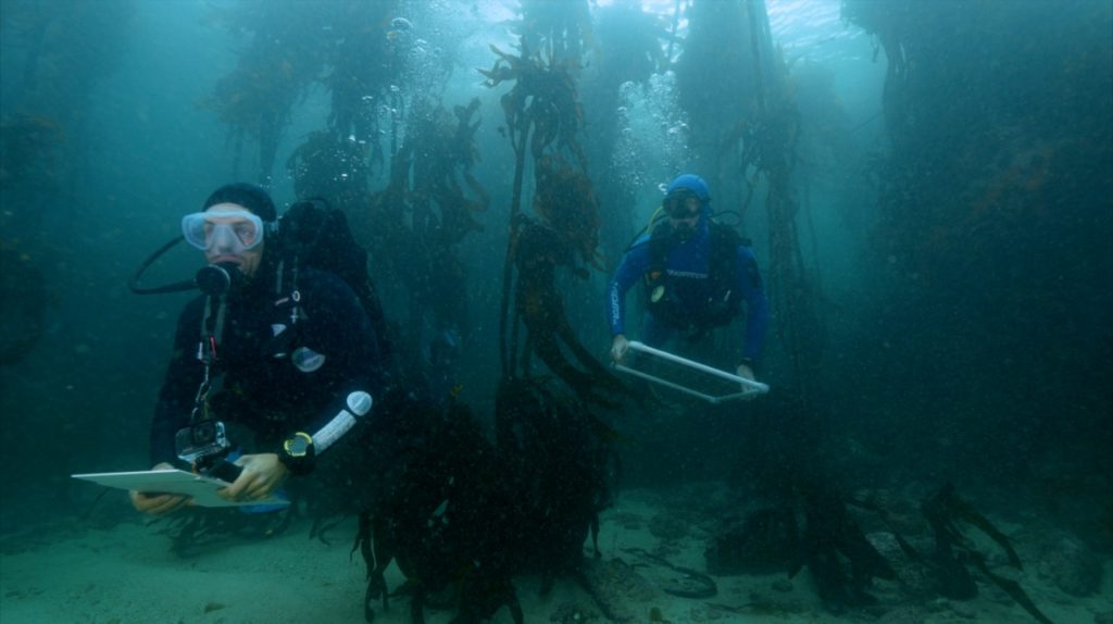
Coming up with the name was a first small step in turning a dream in to reality. We decided we wanted to incorporate R + D which stands for Research and Development, a term commonly used in science, it also fitted perfectly with our organization, a team of Marine Biologists carrying out research and developing future scientists with research and diving techniques. Diving brought us to the extra ‘D’. We spend a lot of time SCUBA diving and snorkeling not only for our field courses but also for our Citizen Science trips, it was important to include diving to give a clear message on what we are about. This led us to the abbreviation RADD, it sounds the same as rad, short for radical “used as a general expression of awe” and we thought that would be, well, pretty rad! We decided on Cape because we are situated on Cape Towns Cape Peninsula and the majority of our work is focused on the capes ecosystems.
Next step. The logo. We incorporated the ocean, this was important to draw peoples attention and be obviously ocean related, we also decided to add something recognizable from where we are based so the mountain in the logo is in fact the iconic Table mountain with devils peak to the left and Lions head to the right, all towering above the crashing Atlantic ocean waves. In the sky above you’ll find the Southern cross star constellation, this was the position of the Southern Cross when we created our logo in March 2017, when what was just a dream transitioned into reality.
0 Comments